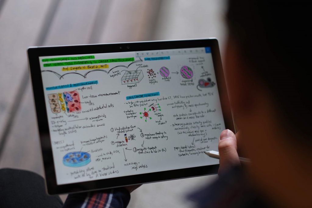
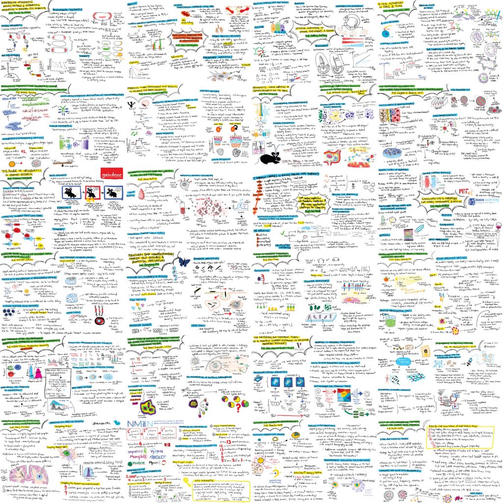
I first saw this type of scientific communication on social media, like Twitter. I thought it would be an interesting tool to summarize someone’s research talk in a graphic format.

We are living in the information age, and there’s really no shortage of information out there. A research talk is typically about an hour long, and my goal here is to condense that into an informative summary. Hopefully that makes it more digestible to the audiences.

Science communications comes in many different forms. Some utilizes social media, some writes editorial pieces, and I summarize research in infographics. The ultimate goal is to bring awareness and educate the public about scientific research. There’s no rigid formal format to present science only in peer-reviewed articles.


